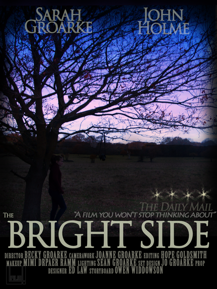
Tree silhoutetted against the evening sky is very good, evocative and romantic.
Looks a bit too much like a novel front cover.
The billing block is too small- should be aiming for at least 4 lines amd bring in from the margins.
Consider other designs e.g. characters lying with their heads together/ actors face faded into clouds/ actors face faded on top of the image.
Can't see the silhouette of the character too much
Have "Side" on the side
Move in from margins
Make actor's names smaller and different sizes
Stars need to be clearer to be more conventional
Look at different fonts- Loopy?/ Fanc y?
Positioning of the font
Make more romantic and less scary
Overall, my focus group really liked the idea behind it but felt that a different approach needed to be taken though still using the same photography. This is also in reflection to one member pointing out that it may be following conventions in it's layout making it connote to a novel front cover, as opposed to a film poster. This is a comment we all agreed on.