In most romance film openings, titles and credits are shown in various ways. In the film Dear John, some of the credits and titles are on a screen of their own. They flash up on a plain blue background with white writing, with the two colours contrasting, still images/ close up's etc were not needed in conjunction with the writing. The writing showing the titles and credits fade in and out, a transition which is very stereotypical of a romance as it gives the shots or titles screens a dreamy effect. After these title and credit pages are shown, the film opening's action begins showing John himself in the war. For a while, whilst this character is speaking, no titles or credits are shown until he finishes his speech with "you" and then another important credits page is shown telling you who made the film. As the film opening progresses, Channing Tatum and Amanda Seyfried's names are both shown. Being the two main characters within the film, the audience can now interpret who is involved because they have seen that these two actors have both been given a screen to themselves with the credits showing importance.
I also looked at my genre specific deconstructions, where I focused on the titles and credits, and their function within the trailer.
Titanic


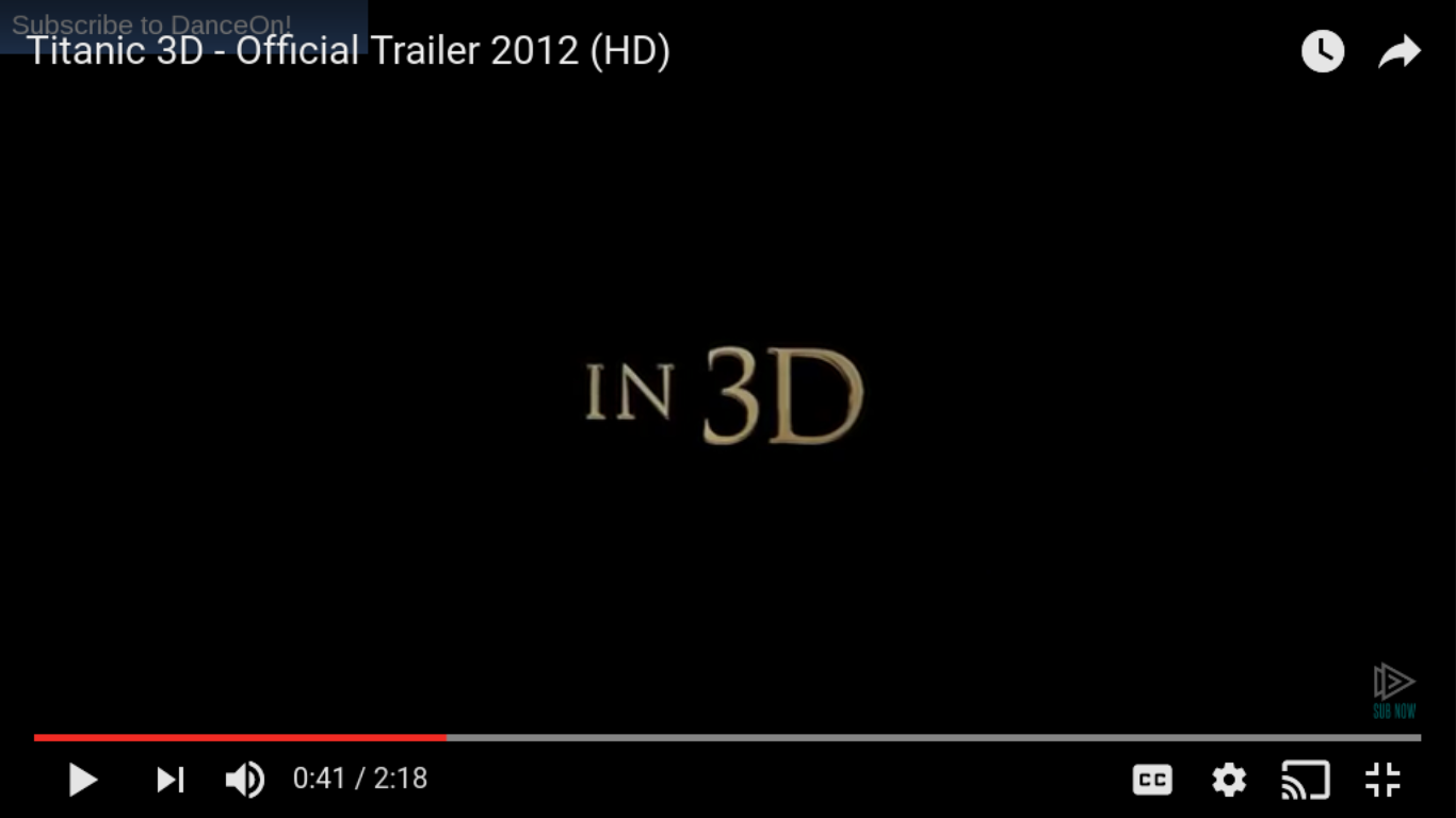


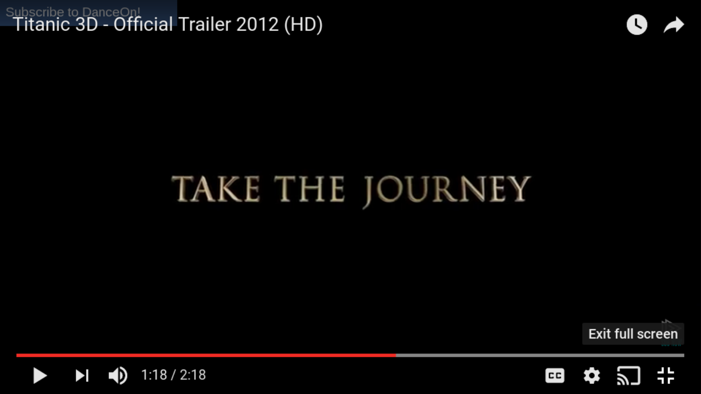
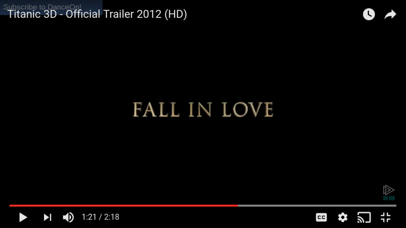


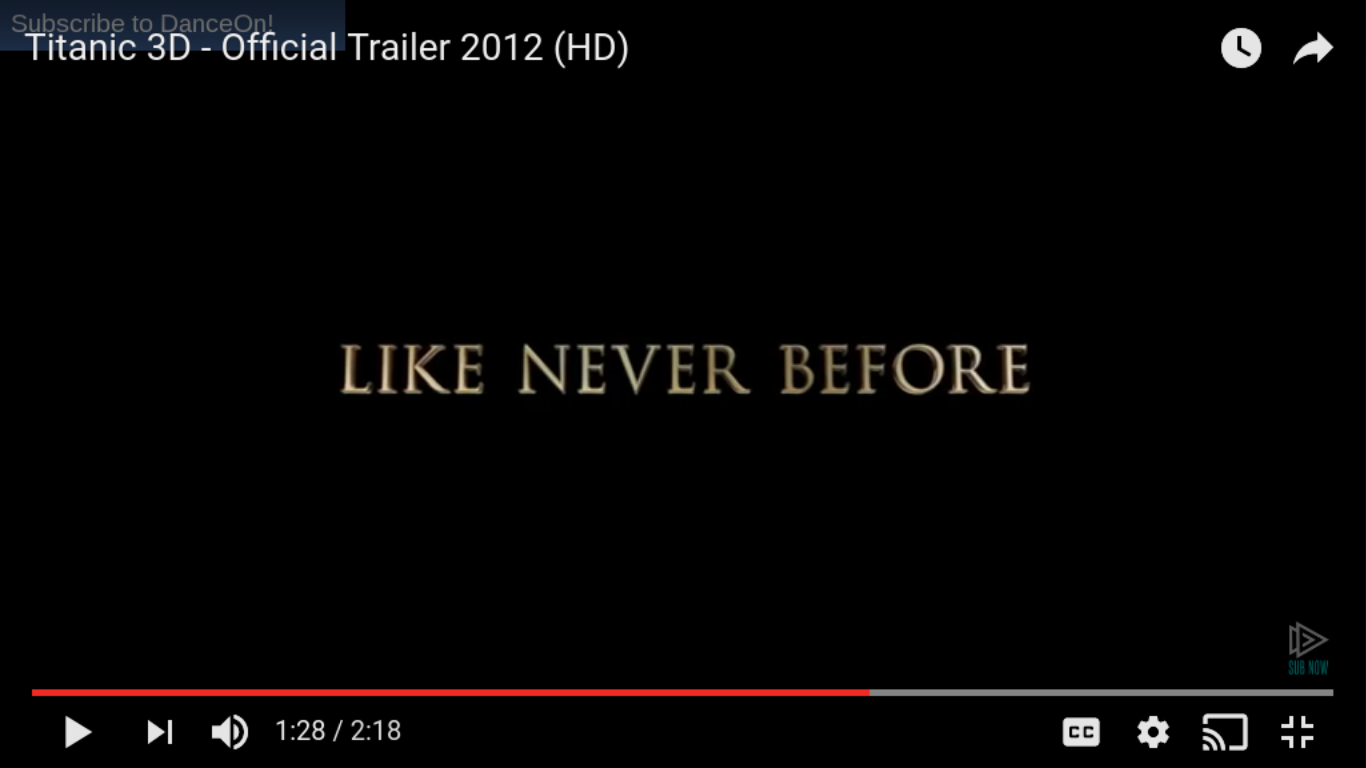
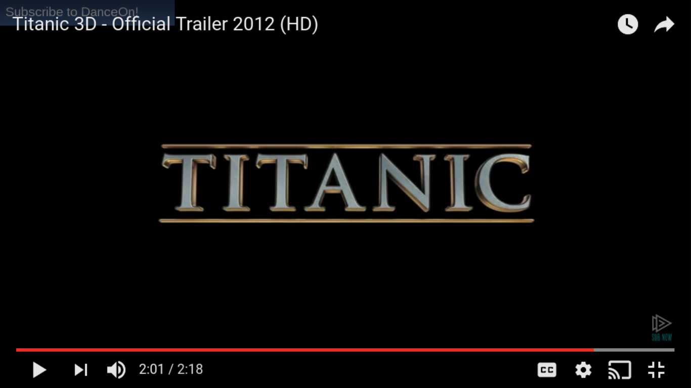
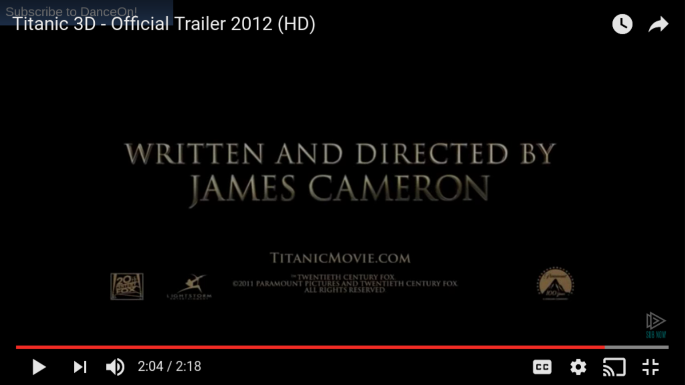
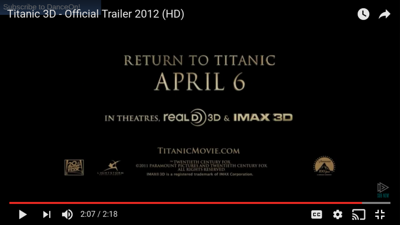
The titles and credits in Titanic use a lot of pre-modifying adjectives, such as "beloved" and "acclaimed" in order to add prestige to the film and present it as a very important, representing the film as one which must be watched. By the use of the collective noun "world's" the film's audience is being represented as worldwide, relating to how the initial 1998 release was very successful and the true story it is based on is well known. The use of 3D in bold and larger font, acts as the films unique selling point, and is therefore highlighted to the audience by doing this. The director's name is also used in the titles, because he is well known within the field and therefore, by naming him and his previous successful film, "Avatar", the film is being promoted to an audience familiar with him or with that film. This is also a use of synergy where the trailer uses cross media convergence by name dropping the other film. The use of the pre-modifying adjective "visionary" the film "Avatar" and James Cameron are being represented as current and innovative. The rest of the titles use a series of imperatives such as "fall in love" etc. The use of the material verb "experience" implies that the film is more than a film but is beyond that, as an experience that the audience must embark on. This also reflects the promotion of the actual Titanic ship, where the British citizens were told that the Titanic was an experience like no other as it was the largest iron built ship of it's time. The title oft the film follows the other titles as a convention of trailer discourse structure, thereafter giving information as to where the audience who have engaged with the trailer are able to watch the film. This again follows the conventions of trailers and complies with it's purpose to promote the film for the consumption of an audience. The Titles are consistently in metallic effect, Times New Roman serif font. This is gold and on black background, giving a sense of prestige to the film as well as following the conventions of gold as used in the film and implied to be the royal colour scheme throughout the actual Titanic ship.
Remember Me

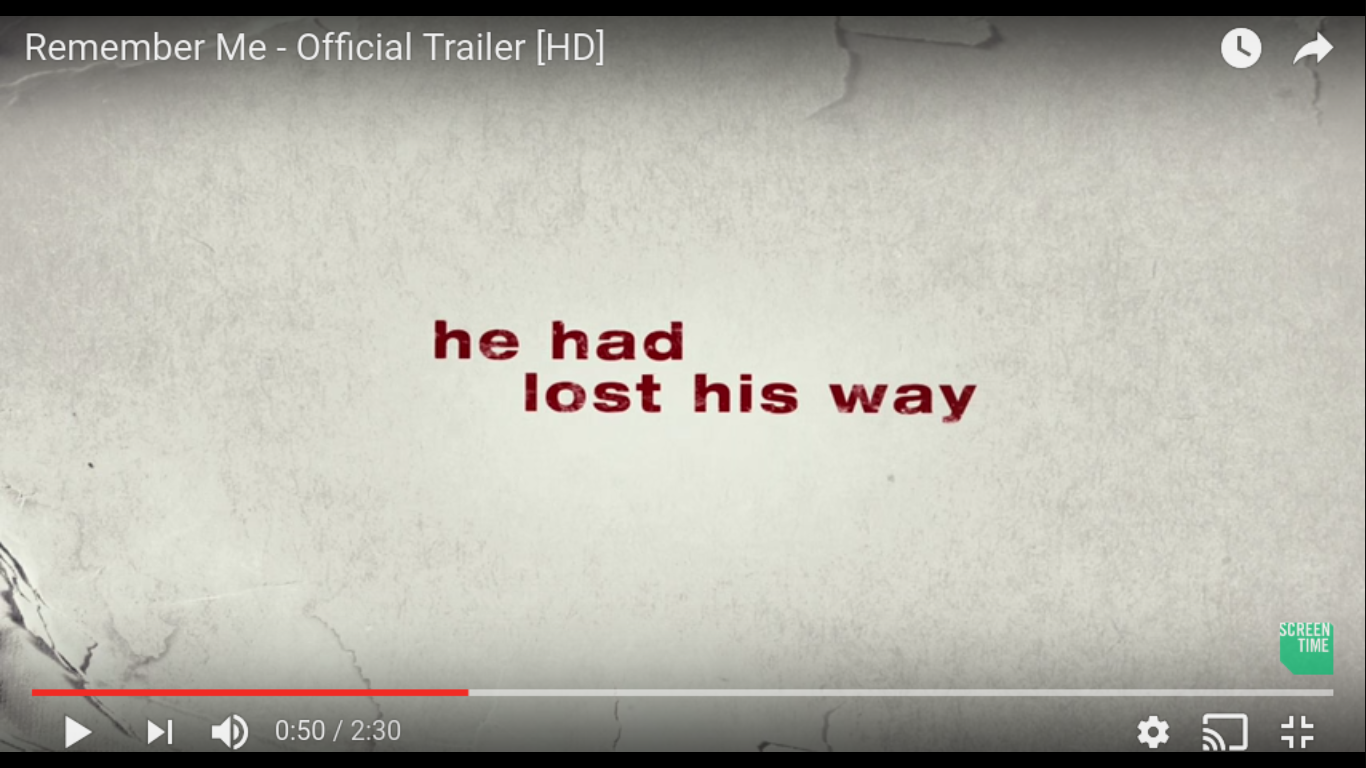


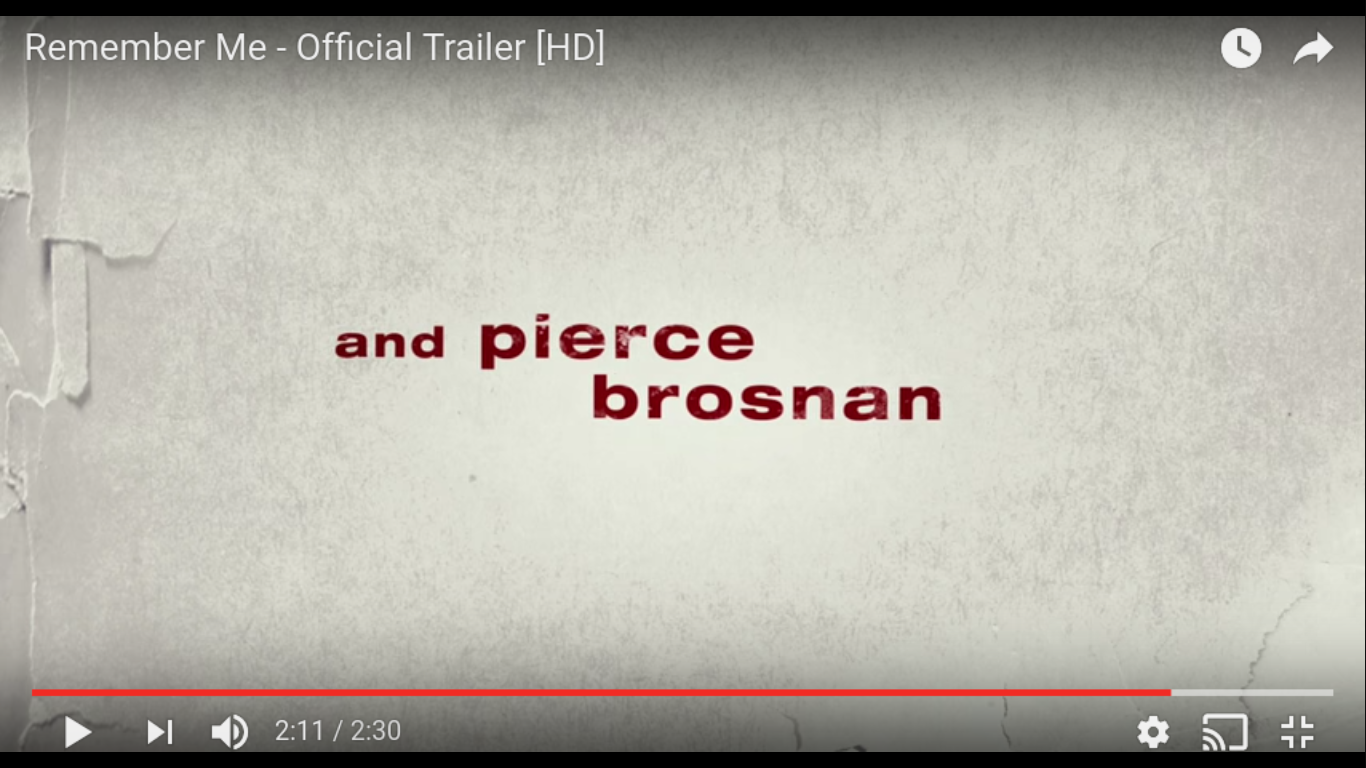

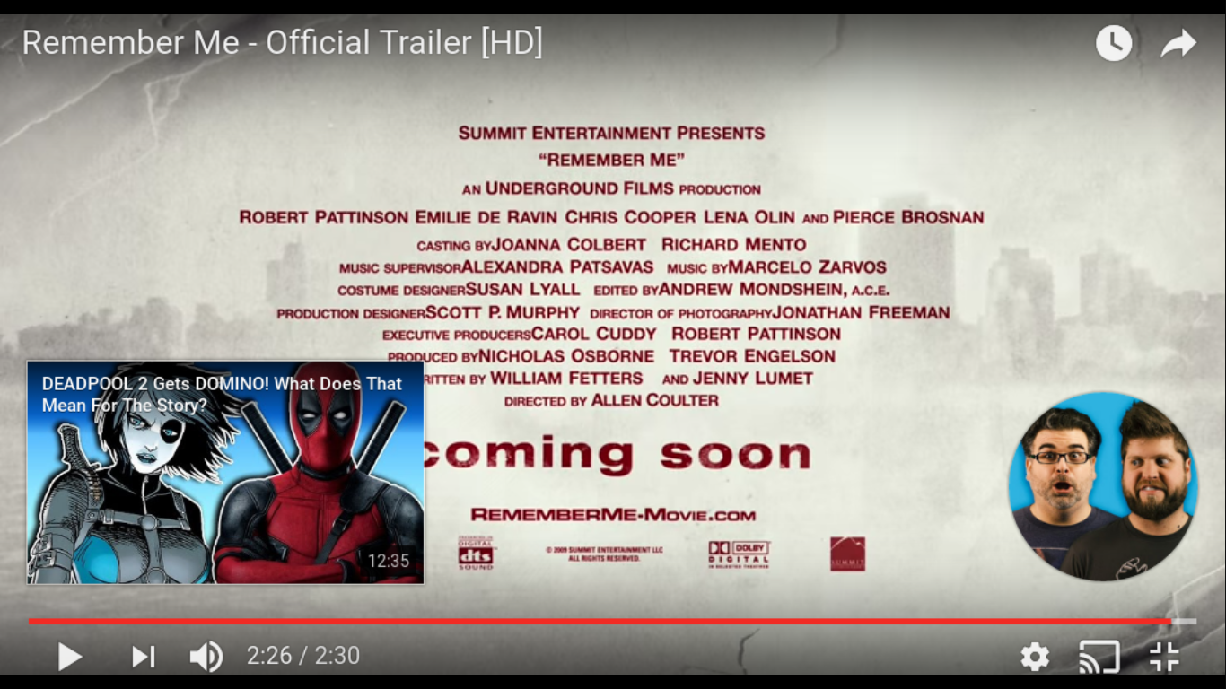
The titles and credits in Remember Me use a lot of simple sentences in past tense, where the titles are describing the main character who is introduced in the moving picture of the film by the use of the personal pronoun "he". The third sentence is split into two screens in order to create tension and as a common convention of film trailers. The titles of the film production company "summit entertainment" are also shown, although in the middle of the titles. The titles hereafter become more frequent, another conventions of trailer titles. The top billing actors are named using lower case letters in order to draw on celebrity endorsement such as from the audience familiar with Robert Pattinson and his other films. The trailer titles are quite short whereby after this the title of the film is presented, followed by the credits such as those that would appear in a print billing block. The use of the red on the grey/ white "paper" background splashed with "dirt", draws on the conventions of social realism and the red connotes to both danger and love. These are both themes within the film.
Love, Rosie
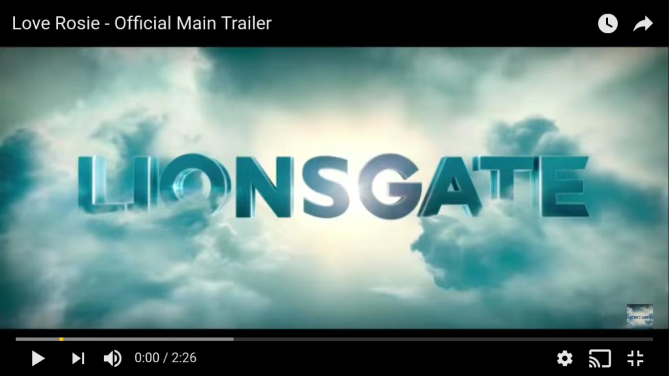
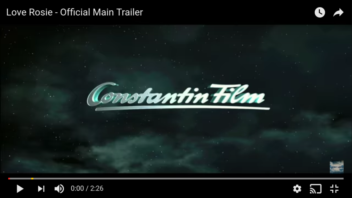


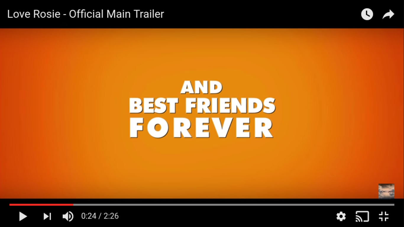

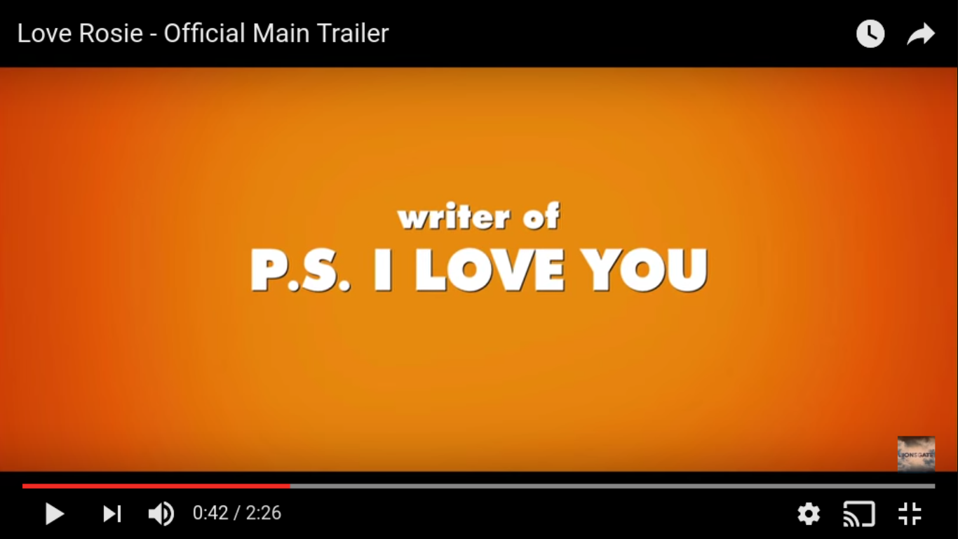
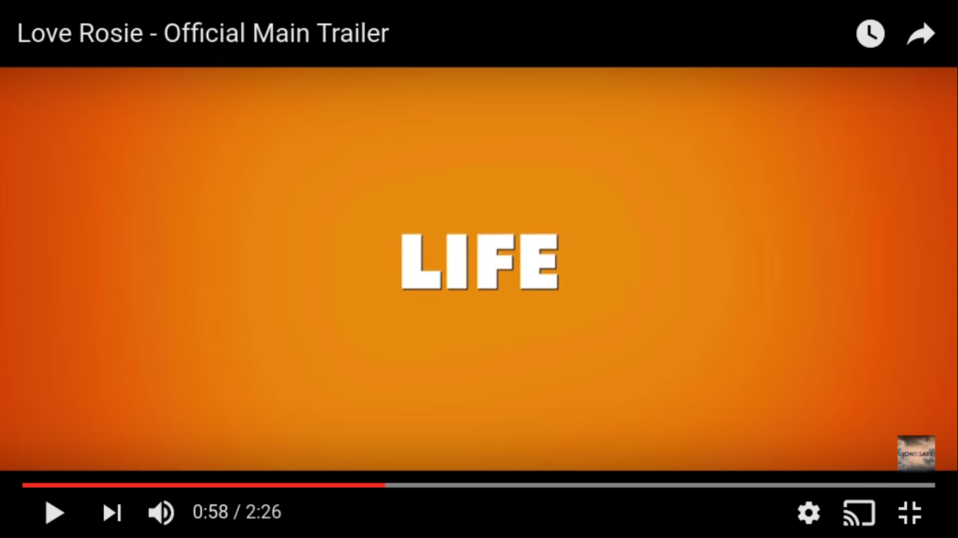
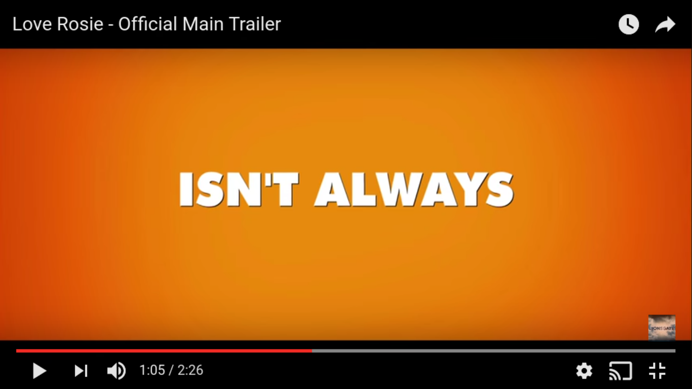
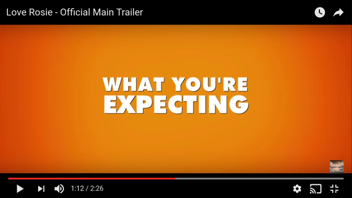

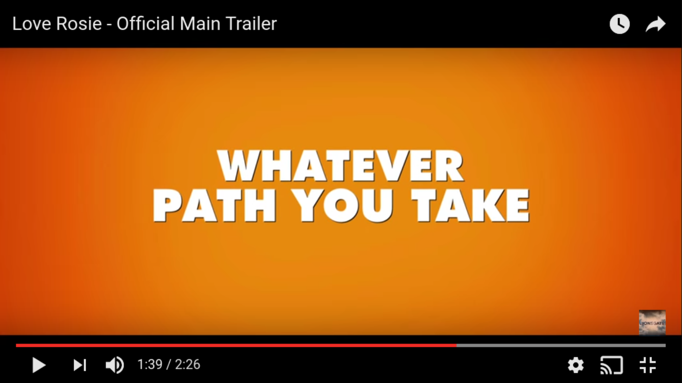
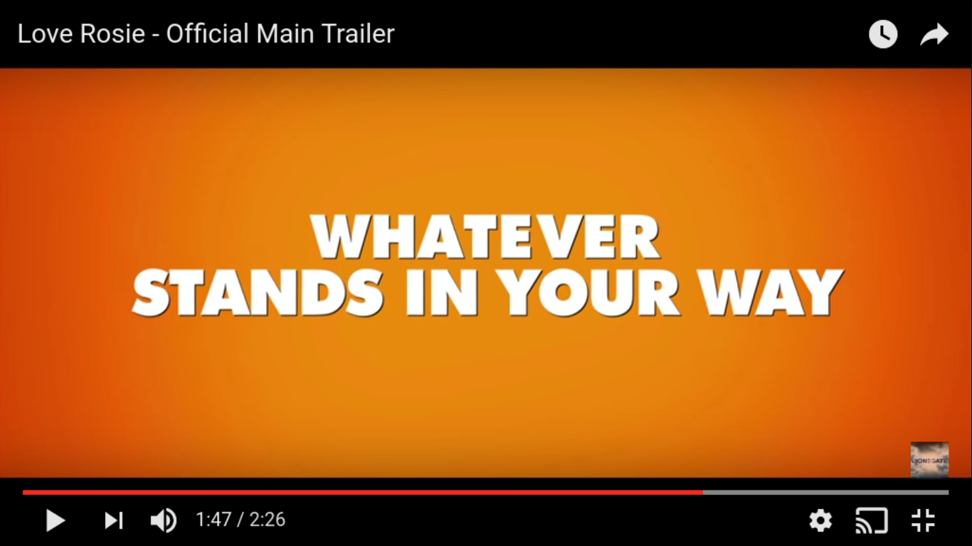
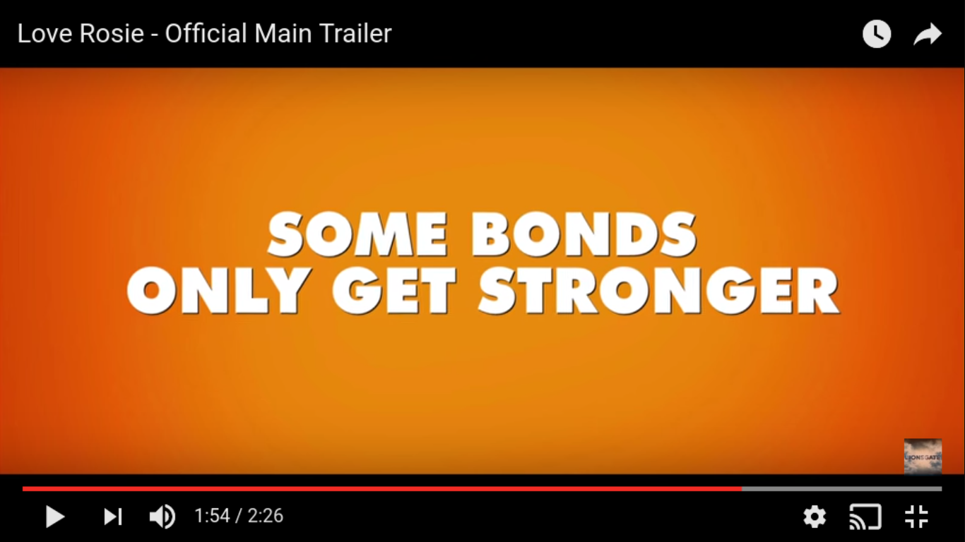

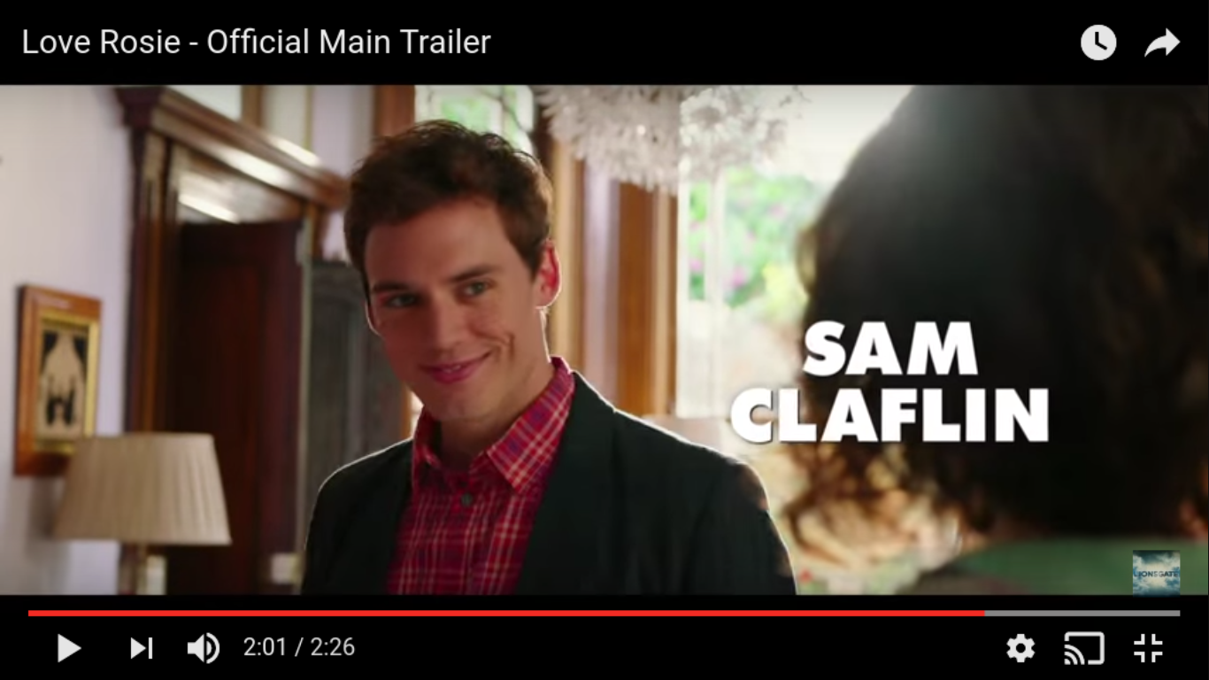
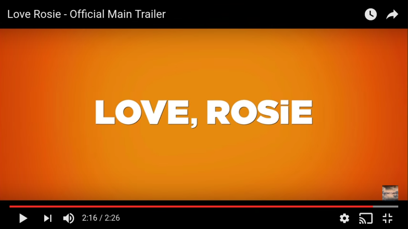
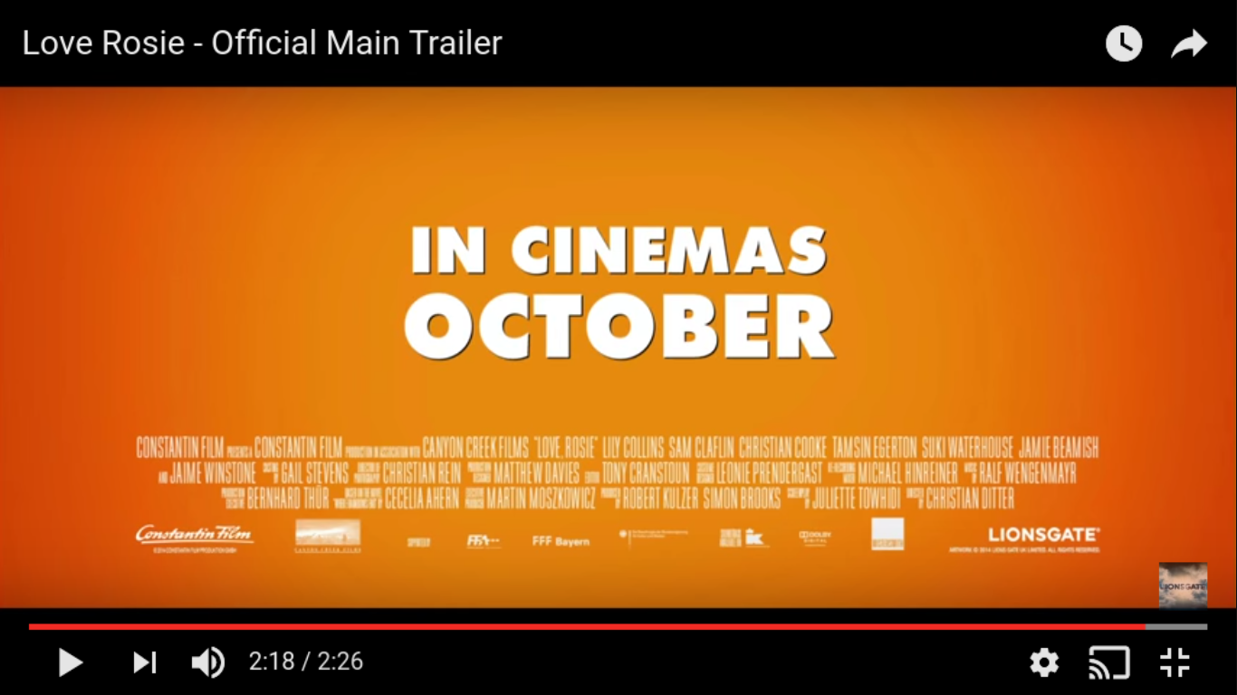
The titles in "Love, Rosie" begin conventionally with the production company logos followed by bold white serif font on top of bright orange background with 3D effect to make it reach out to the audience. The use of the bright orange colour relates to the positive theme of the film and the bright colours used throughout. The sentences are split throughout and use the discourse of opinion presented as fact in relation to how the audience should feel about love. The use of the noun "life" on it's own screen creates tension. The intertextual mention of "P.S I love you" uses synergy and draws on an audience who would be familiar with this film, and being a similar target audience engages this particular audience. There are much more titles used in this trailer compared to the others, where they act as a commentary and encourage the audience to watch the film. This may also be because this film is aimed at a slightly younger audience who would react positively towards being inspired by what is being said in the titles. The actors names are blended on top of shots of the actor themselves and are only up for 1 second. This allows for celebrity endorsement and also relates specifically to a younger audience who are less likely to be familiar with the actors, therefore they are signposted by their names on the same screen rather than separately.
The Space Between Us
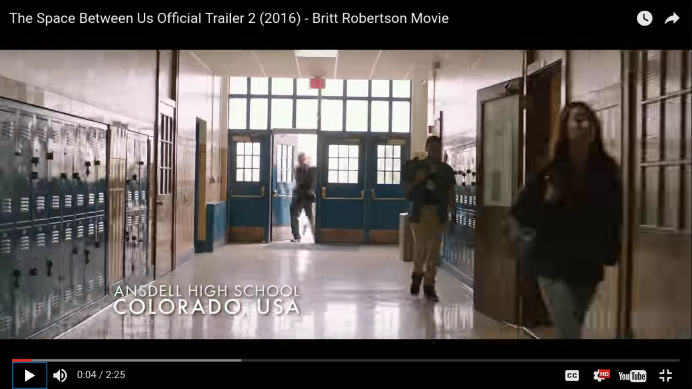

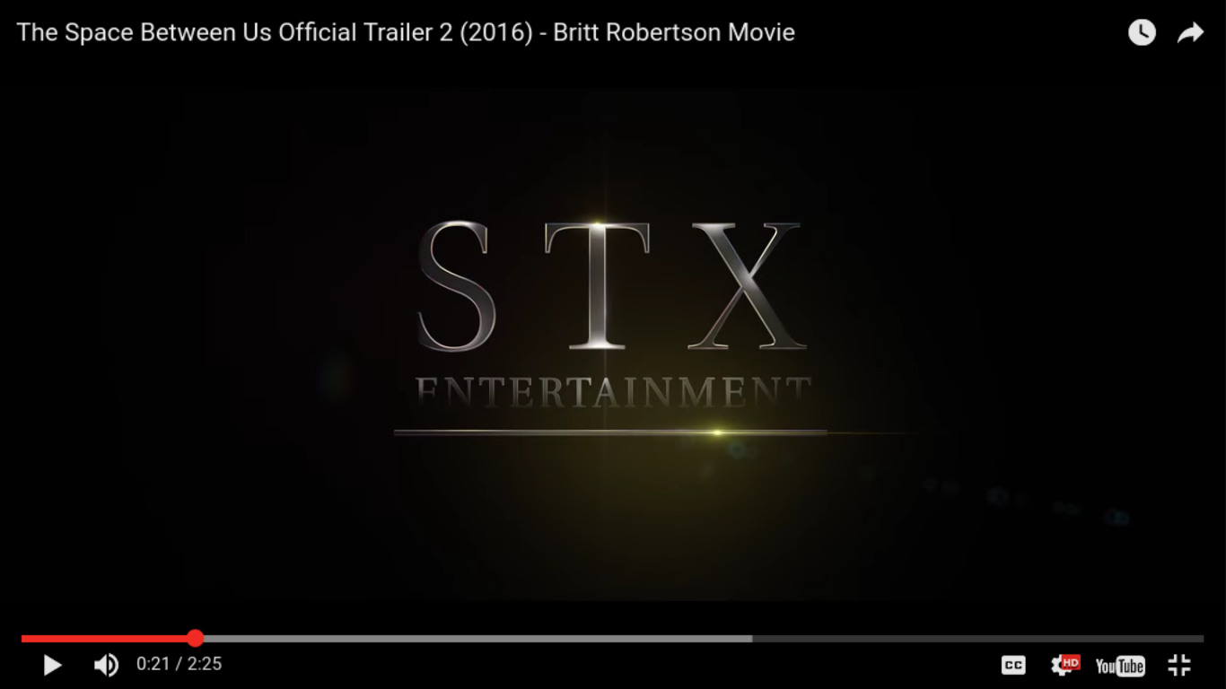
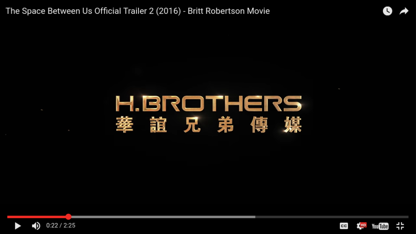

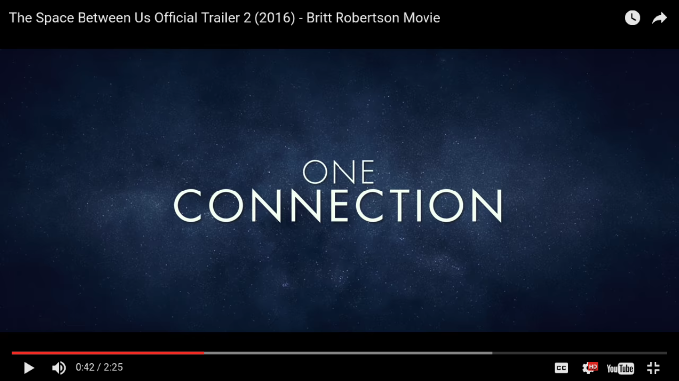
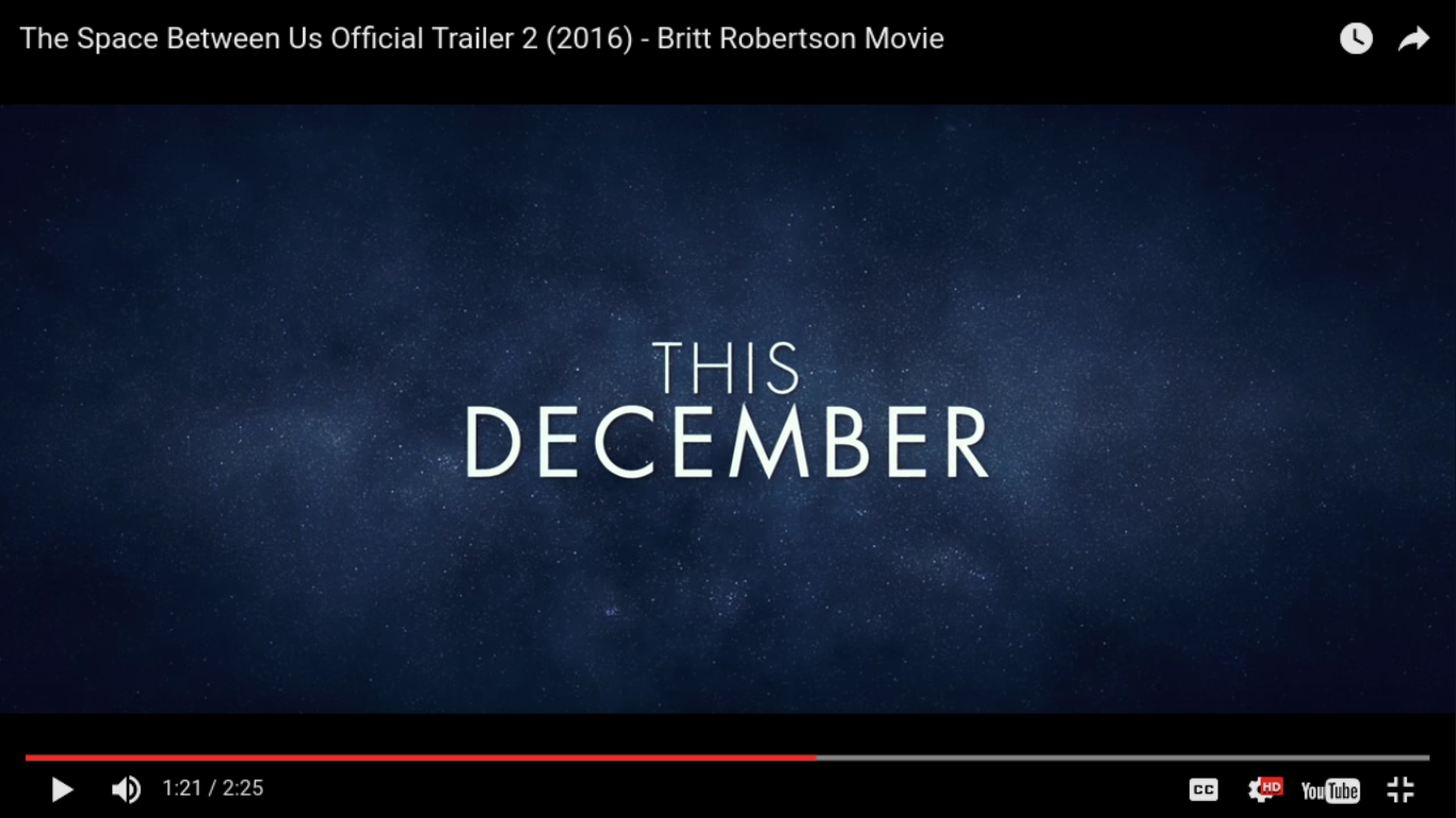
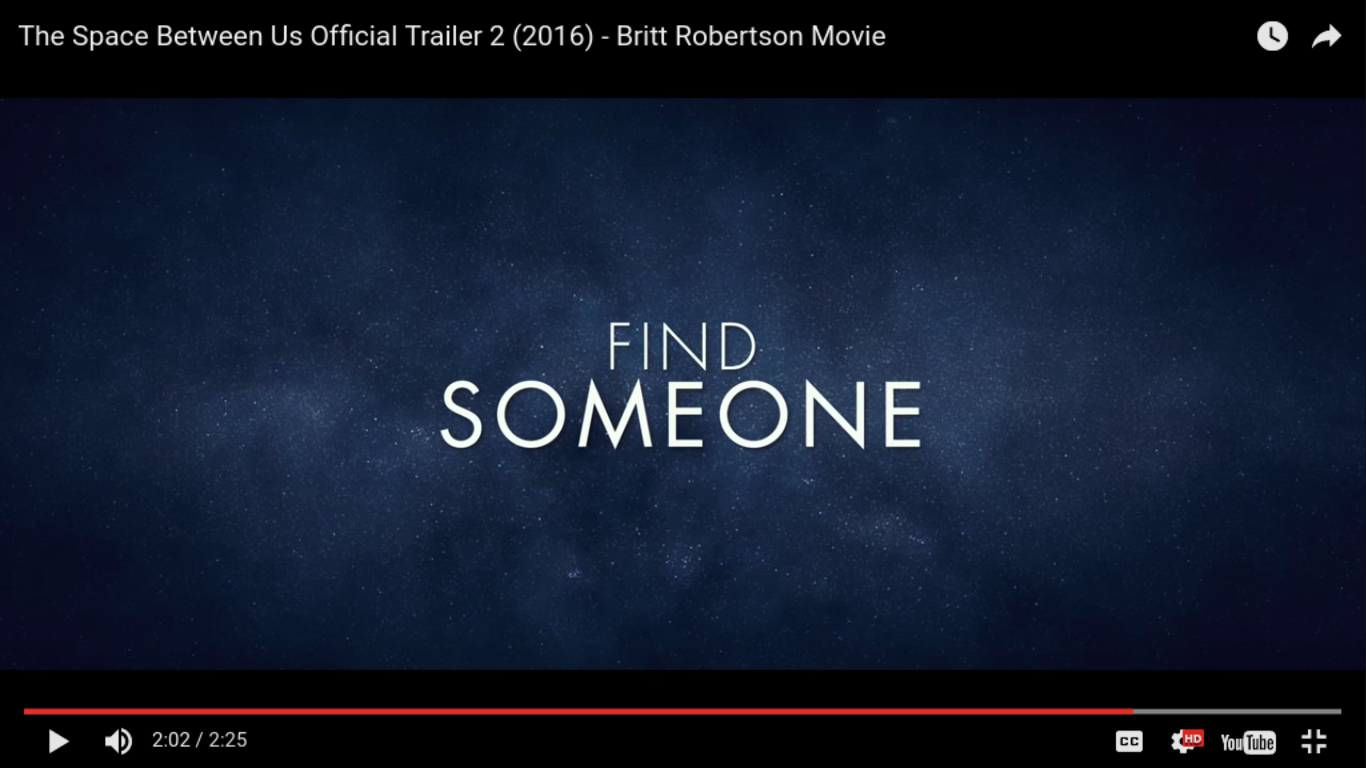


The space between us opens with two extreme long establishing shots, and titles enter with a "typing" transition effect, where each letter appears one after the other. This follows the conventions of the movie by connoting to Sci-Fi space themes. This font acts asn a caption to describe the shot and where it is, therefore establishing where the movie is set. The production company logos follow this using metallic font effect as conventional of the logo of the companies uses. The following 6 titles screens use only two or three words, where one is in smaller font, on top and not bold and another follows underneath, highlighting it as a key word or theme. The first three of these slides use a determiner, where the quantifying determiners "one" and "two" are used, followed by the demonstrative determiner "this". The imperative verb "find" is used in order to instruct the audience what they should do and what they will do if they watch the movie. These texts are all on a galaxy background with a gradient focused on the outside and lighter of the inside. This creates the effect of tunnel/ portal vision, reinforcing conventions and themes of the genre as well as highlighting what is being said. The font used is serif and consistent throughout, also reinforcing conventions of space themed. The final tital screen uses glistening metallic effect, with the same font. The background of this however, follows the same colour theme as the production logos screen but has an image of the sun The definite article "the" is very small, whereas the noun "space" is in captials and is very large.
