|
Try taking a more conventional approach
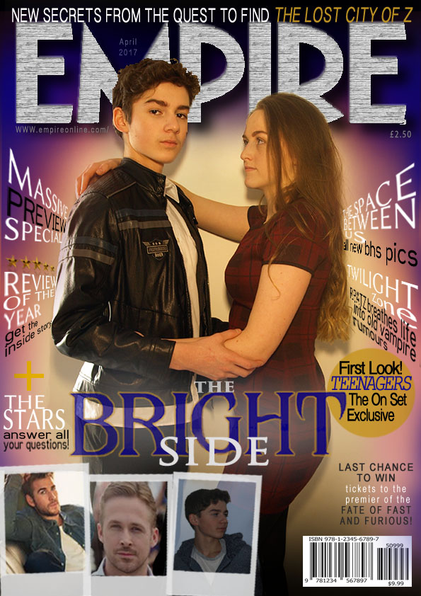
use a red magazine headline and continue it throughout add the corner stamps get rid of the polaroids move image over to allow text on one side and the male in the middle of the magazine to gain better audience engagement through synthetic personalisation through eye contact |
|
