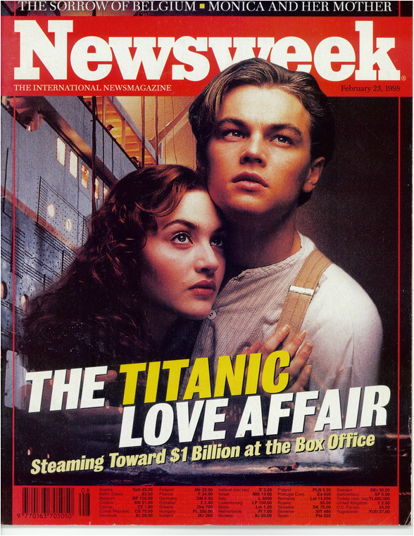
Genre- Drama/ Romance
Shown by the closeness of the two characters and the way they both seem to express their emotion towards what is going on, whilst embracing.
Banner/Masthead/Logo/Branding- Newsweek
Plain textual font in white colour in the forefront of a red background banner. This banner ties in with the magazine theme and runs underneath he frontal image.
Main/Primary Image-Jack and Rose holding onto each other
Shows a demonstration of the difference between the femininity of Rose and the masculinity of Jack. It represents that the story revolves around them and they are the main characters and therefore focus of the film. It makes the audience want to know how they got there, especially due to the differentiation in the class represented by their clothing
Secondary Image- The Boat behind them
It shows that the film does revolve around the boat but this is underpinned by the love story happening on it.
Indirect/ Direct Address- Indirect
They are looking up into the sky over the shoulder of the camera. They look fearful and uncertain, making the audience want to know what has led them to this.
Feature Article- The Titanic Love Affair
This is in block capitals slanted along the bottom third of the front cover. It is in white upon a dark background which draw focus, also by having “titanic” in yellow. This stands out from the rest of the poster
Cover Lines- The Sorrow of Belgium, Monica and her mother
This shows some of the other articles in the magazine but which are small to show that they lack importance
Buzz Words- Streaming, Sorrow
There are not many buzzwords on this magazine but the word streaming is used as it relates to the streaming of a boat
Barcode- Barcode on red background and at the bottom
This is contextually appropriate and fits in with the magazine genre
Date- February 23rd 1998
This is small and at the top under the title, implying that there are more than one issues of this magazine, and making it contextually appropriate
Colour Scheme- Red, yellow, brown and white
This relates initially to the colour scheme of the magazine but then also to the colour scheme of the film and the boat. Using certain colours to stand out whilst having brown and white as representative colours
Representation/ Stereotypes- The female being comforted in the arms of the male who looks like a protector, yet seems like he has a softer side. Representations of class
the female character is represented as week and in need of the care of the male character, implied by the body language and positioning of her in his arms as they look worried. the class of the two characters are shown through the uses of their clothes but then classes stereotypes of being impenetrable networks are challenged by their interaction
Target Audience- 20+ predominantly females
this relates to the age of the characters and the level of interest that they are likely to have in the story of the Titanic disaster. this then relates also to the target audience of the magazine,
